It was interesting to go through my collection of photographs and discover that I spend so much time filling the frame that I sometimes forget to consider how space can actually enhance the quality of an image and emphasise the subject. I'll be making a point of exploring this further with my photography and adding to my 'toolkit'.
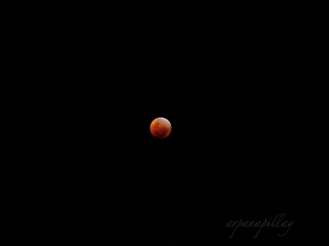
I begin then, with Space itself and a photo I took of a lunar eclipse back in 2008.
With the sky as space, the theme continues in the picture-postcard-blue that provides a background for cherry blossoms, a lighthouse picnic and a pub sign.
It is all too easy to take portraits and place your subject slap bang in the centre; however, off to one side can really break up the predictability and emphasise character.
Textured backgrounds can really bring out a subject, and the more you see of that gravelly, rocky and brick space the more interesting the subject can end up looking.
Finally, a scene that is mostly space. It's sometimes hard to imagine that you could capture the elements of a landscape if most of what is photographed is space. You usually expect to see it filled with well, 'scenery'. But sometimes less is more - and more space is the key. I think in this photograph it just works so well.
Link to Kat Eye Studio

